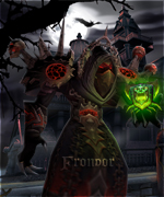
After being a bit bored at school at tried to recreate my rogue with the legendary daggers. I've had some lessons at school about photoshop but that's all the experience I have. Would love some constructive criticism.

-
 Member
First photoshop project
-
Member
right side appears to be more complete compared to left
-
Member
The right side has a bit more swirls, but I didnt want to make them exactly the same.
-
Member
im not specialist and i find it awesome.
-
Member
I can see what you meant to do, but I think that adding the effect on the left side (in different positioning) would make a bit more symmetrical, and make the right side less 'busy' or filled up, if you know what i mean.
also, I don't know if you got the character from model viewer or just made a screenshot, but I feel like you could've chosen a different (color) pair of Boots and Belt. The blue/green on the boots create multiple attention points.
all in all.
good concept, good detail, nice effect.
8/10
-
Member
Hmm, yeah. It's kinda filled up compared to the left side. The character is from modelviewer but with the exact same gear as I have in-game (apart from the legendary's of course), so I didn't want to mess with that. Thanks for the tips :)
-
Member
The only bad things I see about it are
- Wings are spread too much and the left side looks a bit blurred, with less smoke than right one
- Character is way too contrasted
Overall it is really nice.
-
Member
Not sure what I did to the wings then, since they got the exact same filter and other things. The character is indeed way too contrasted. I used a light image as a background and I think I used overlay or something.
Really don't know how to make the character look a bit dark, but still clear enough to see the details :/
-
Member
You should have used different brushes for each swirl, to make it more "realistic".
The wings are fine, but you shouldn't have added more swirls to the right one.
About the render, its borders have to be corrected a bit ^^
The contrast is fine IMO.
I like it.
-
Member
Pretty good, but yeah, you failed alittle bit with contrast, try using Magic Bullet Photo Looks plugin next time. Btw what program did you use for that model?
-
Member
Didnt want to use a standard plug-in but rather do it myself and test out different filters and effects.
I used WoWModelViewer.
I did use different brushes, but they do look alike I know. More swirls to the right one? 0.o
Might have used a bit more feather indeed. Thanks :D
Edit: Minor update.

Asked some of my classmates opinions and its really a personal preference on what you like. So kinda hard to decide. I also think I shouldn't edit extra stuff since it will get to cluttered and less detailed. Onto the next project :D
-
Member
Image looks very nice; however, I would recommend that the wings stand out more with a focal effect or a more luminous color too it. That wing span is huge and it's honesty the most attractive detail of the picture.
-
SleetzaGuest
Pretty sweet man. Maybe add some effects to the blindfold, a glow or something?
-
Member
Little project I did with my phone, it's not the best I did since I redid some of the different layers too many times. And got fed up with it.


-
Member
that's really awesome ! inspiring :P

 Quote
Quote